Diagrams
While communicating ideas, diagrams become an essential component to inform the reader. Sometimes it’s time-consuming and not worth spending time when return is low. At the same item, having a simple and minimalistic way to communicate the architecture can go a long way.
Diagrams is Python library(pip install diagrams) that lets you generate the system architecture by writing Python code.
From the website
Diagrams lets you draw the cloud system architecture in Python code.
It was born for prototyping a new system architecture without any design tools. You can also describe or visualize the existing system architecture as well.
Diagram as Codeallows you to track the architecture diagram changes in any version control system.Diagrams currently supports six major providers:
AWS,Azure,GCP,Kubernetes,Alibaba CloudandOracle Cloud. It now also supportsOn-Premisenodes as well asProgramming LanguagesandFrameworks.
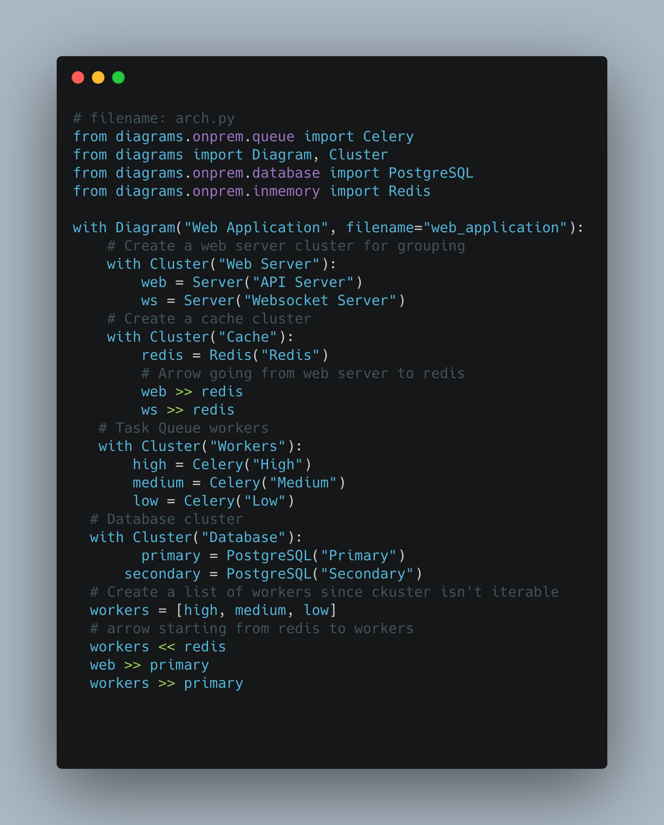
Say you want to draw an architecture diagram to represent an API server, WebSocket server, Redis, Background Workers, and Databases communicating. With diagram library, it’s easy to describe the flow in 18 lines of Python code(Dude, is loc an accurate metrics?)
# filename: arch.py
from diagrams.onprem.queue import Celery
from diagrams import Diagram, Cluster
from diagrams.onprem.database import PostgreSQL
from diagrams.onprem.inmemory import Redis

with Diagram("Web Application", filename="web_application"):
    # Create a web server cluster for grouping
    with Cluster("Web Server"):
      	web = Server("API Server")
        ws = Server("Websocket Server")
    # Create a cache cluster
    with Cluster("Cache"):
        redis = Redis("Redis")
        # Arrow going from web server to redis
        web >> redis
        ws >> redis
   # Task Queue workers
   with Cluster("Workers"):
       high = Celery("High")
       medium = Celery("Medium")
       low = Celery("Low")
  # Database cluster
  with Cluster("Database"):
  		primary = PostgreSQL("Primary")
      secondary = PostgreSQL("Secondary")
  # Create a list of workers since ckuster isn't iterable
  workers = [high, medium, low]
  # arrow starting from redis to workers
  workers << redis
  web >> primary
  workers >> primary
The created image after running the program(better to run it in a shell) looks like the below one
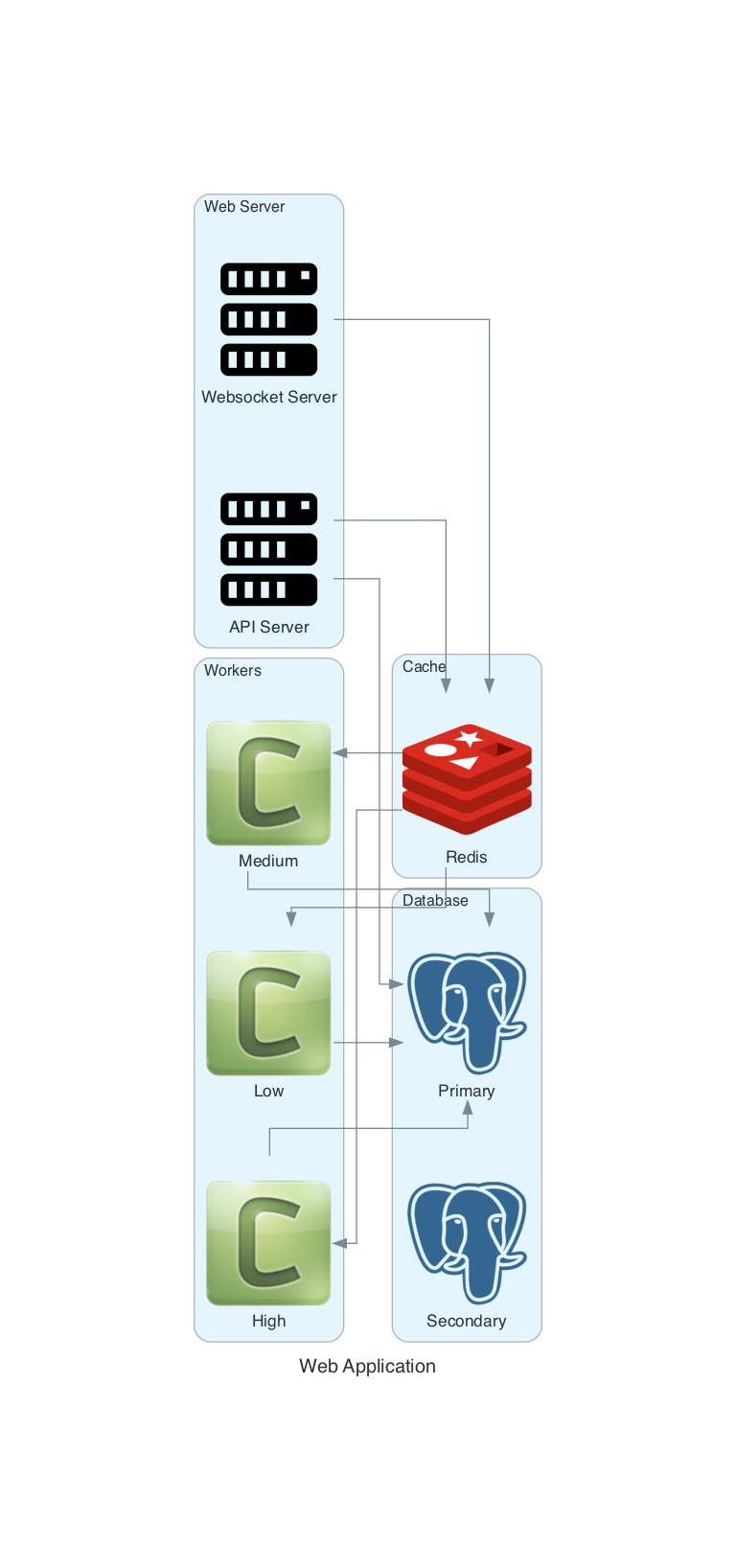
A few points to remember, », « used for representing the arrow direction.
- First, create individual components and then draw the communication flow.
- web » primary means the connection/communication starts from web to primary component.
- workers « redis means the communication starts from workers to redis component.
Other features
- Arrows can have colors.
- The edges can have labels say protocol for communication.
- Rather than », «, use - to indicate the arrow without edges.
Specifying the components' location in the image is not documented/not possible. When the cluster contains 3 or 4 pieces, the diagram grows vertically.